brand guidelines
Welcome to our brand guidelines, a digital tool we’ve created to help make it a little easier for you to maintain our brand.
Here you'll find the foundational elements that create our Panasas brand identity. Consistency is key in keeping our brand presence strong. Consistent and repetitive usage of these elements will create lasting recognition and a memorable connection with our audience.
logo
The Panasas corporate logo is the most visible graphic element of our company and brand. It is the official signature on all our communications and a guarantee of the quality of Panasas products and services.
Correct usage of the logo is important for building recognition of the Panasas brand as well as protecting our valuable trademark rights. Position, color, and spatial and proportional relationships are predetermined and should never be altered.
Use the graphic files provided; do not attempt to reproduce this logo on your own. Contact Panasas marketing department for approval of any logo usage which seems questionable.
PRIMARY LOGOS
Our master logo contains the full Panasas name and the logo symbol contains our 'Infinity' emblem.


MASTER LOGO
Always maintain a distinct contrast between the Panasas logo and the color of the background on which it appears. Always allow sufficient space around the logo.


LOGO SYMBOL
There are instances where the 'Infinity' logo symbol may be used on its own. Careful consideration should be taken when using the symbol instead of the master logo. To help decide, ask yourself: Will my audience know the Infinity stands for Panasas? The symbol may be used for social media profile avatars, internal branded schwag, and on-location branded collateral.


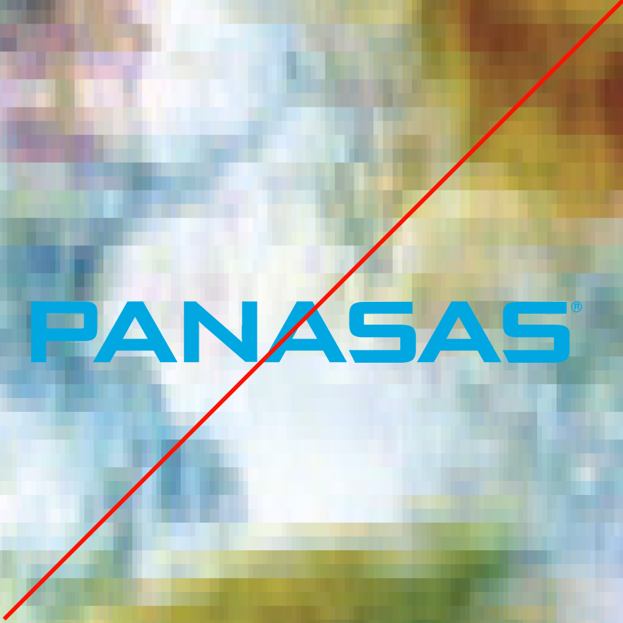
INCORRECT LOGO USAGE
- Never stretch the logo horizontally
- Never stretch the logo vertically
- Never alter the perspective
- Never place logo on a busy texture
- Never add gradients or special effects
- Never change the proportions of the text
- Never place the logo in a shape
- Never add elements to the logo
- Never add a tagline to the logo


COLOR
Colors play an important role in brand recognition, therefore consistency is crucial. These colors were selected to reflect Panasas’ modern technology.
PRIMARY COLORS
Panasas Blue and Panasas Medium Grey are our primary brand colors. Panasas Blue is used for the logo and CTAs while Panasas Medium Grey is used as a background fill and headlines/body copy.
SECONDaRY COLoRS
The bright yellow, orange, red and purple are secondary colors that should be used sparingly in print and rarely used on the website.
Grays
Darker and lighter grays are our gray brand colors. You will see these used in various areas on our website to help with page sections, headlines, and iconography.
typography
Written communications are an essential tool in projecting the Panasas brand, consistent typography plays a significant role in achieving this goal.
'Gotham' was selected for its classic yet rounded/friendly letterforms as our print font and should be used in collateral and trade show displays.
‘Roboto’ and 'Roboto Condensed' are our digital brand font and should be used as often as possible on the web. We use all weights of this family. 'Roboto Condensed' is used for our headlines, while 'Roboto' is used for body copy.
ICONOGRAPHY & GRAPHICS
Iconography used in collateral and on the web should be consistent in color and style. All icons should use the Panasas Blue and Panasas Medium Grey as the primary palette. The style should be clean, thin line work with rarely any fills in the shapes.
Graphics and diagrams used on the site should follow a similar style as the icons. Please only use colors from the available palette, and the Roboto font.


photography
Our photography always has a modern and technical feel. When used as banners on web pages be sure to use a dark overlay so text can be legible and accessible.
photography art direction